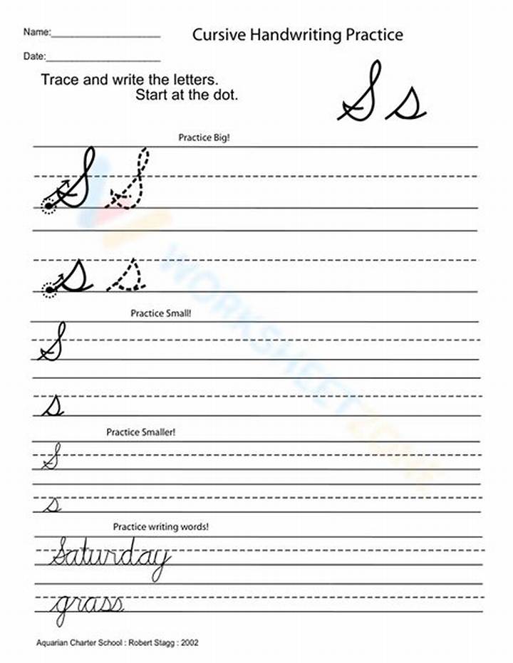
Even though both letters share an “S” theme, the capital version usually needs more presence. Lowercase “s” is typically smaller and more fluid in everyday word flow. Capital “S” needs to start a word cleanly and visually “sit” on the line.
The most noticeable differences tend to be these: capital S often uses a stronger entry and a larger upper curve, while lowercase s usually relies on tighter loops and smaller pivots. Because capitals affect readability at the start of words, they often demand more deliberate spacing and a more consistent height.
| Feature | Lowercase “s” in cursive | Capital “S” in cursive |
|---|---|---|
| Size | Smaller, fits within typical lowercase height | More prominent, anchored to capital height guide |
| Entry stroke | Often smoother and less emphasized | Often clearer entry to start the word neatly |
| Mid-turn | More compact pivot | Usually larger, with a more noticeable direction change |
| Exit for connections | Supports the next letter with smaller motion | Supports the next letter with a more confident finish |
Once you accept that the capital S has different “jobs” in a sentence, your practice becomes more focused—and easier to measure.

