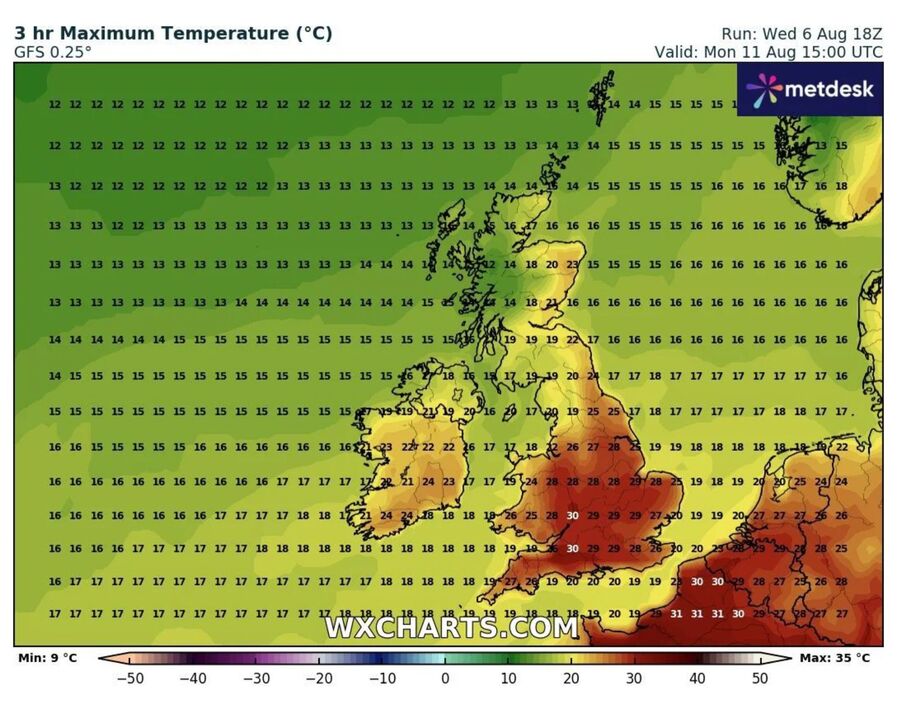
Now, let’s put this in perspective. If you live in Death Valley, California, 33°C is a nice spring afternoon. They laugh at our “heat wave.” But for the UK, it’s a different story. Our infrastructure isn’t built for it. Trains slow down out of fear of the tracks bending, and our homes are designed to keep heat in, not out.
So, when you see that 33°C on the map, remember you’re experiencing a local celebrity. It’s like the UK’s version of a tropical storm. It’s not the most extreme heat on the planet, but it’s our extreme heat, and we get to talk about it, worry about it, and eventually enjoy it.
The Coolest Part? Watching the Forecast Evolve
The most interesting thing about these hot weather maps is watching them change. You can check the forecast on Monday, see a red blob on Wednesday, and then check again on Tuesday to see if it’s gotten bigger or shifted. It’s like tracking a friendly, warm monster that you’re not afraid of, just curious about.
Will it hit exactly 33°C? Or will it fizzle out at 31°C? The suspense is real! It turns a simple weather report into a daily mystery. You become a part-time meteorologist, squinting at the map and saying, “Hmm, look at that isotherm flexing.”
Ultimately, a 33°C forecast is a great conversation starter. It gives you a shared experience with everyone around you. You can bond with a stranger on the bus over how “unbearably hot” it is, or you can celebrate the fact that you finally get to wear those shorts you bought two years ago. So, grab a cold drink, pull up the latest UK hot weather map, and just enjoy the ride. It’s warm, it’s weird, and it’s wonderfully British.