Step into a station, and the colour changes again. On the signs, it’s a rich, deep purple that screams “I’m modern and important.” But on the train platforms, look at the roundels—those blue and red circles with the bar through them. The purple there is often much lighter, almost an electric mauve.
It’s as if the colour can’t decide if it wants to be a sophisticated wine or a punk rocker’s hair dye. I once saw it under the harsh lights of Paddington, and I swear it looked pink. I nearly called the police. “Hello, yes, my colour identity has been stolen.”
And don’t even get me started on the digital version. On your phone’s Citymapper app, it might be a crisp, saturated violet. On a greasy laptop screen in a café, it’s a muddy grey-purple that looks like a depressed bruise. Consistency? The Elizabeth Line laughs at your consistency.
The Great Purple Conspiracy
Why does this matter? Because the Tube map is a sacred document. The colour of a line is its soul. The Bakerloo is a grumpy brown. The Central is a screaming red. The District is a crisp, reliable green. But the Elizabeth Line? It’s purple. And purple is the colour of mystery, royalty, and, if you look at the price of a monthly travel card, financial ruin.
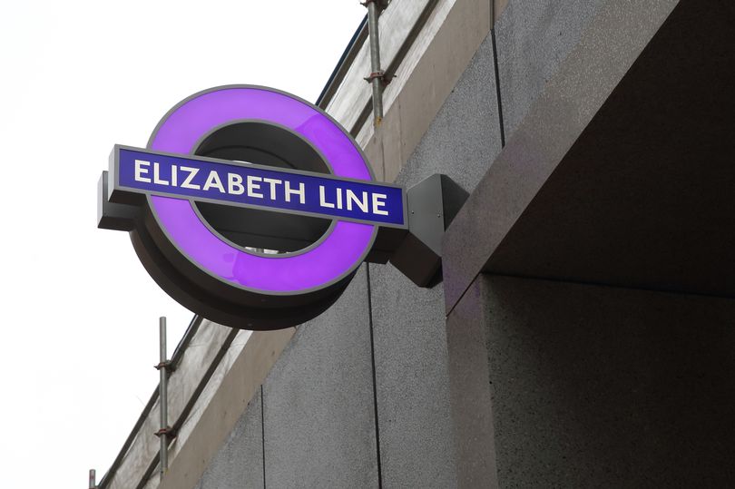 Why TfL chose the colour purple for the Elizabeth Line – Sign Design
Here’s a surprising fact: the colour was almost yellow. Imagine that. A yellow Elizabeth Line. It would have clashed with the District line, causing a visual apocalypse. “Sorry, I thought I was going to Ealing Broadway but I ended up in a field of daffodils.” They wisely chose purple to stand out, but it didn’t stop the confusion.
Another fun fact: The shade is officially called “Pantone 266 C,” but TfL’s own design guidelines describe it as a “vibrant purple.” Vibrant? Half the time it looks like it’s having a midlife crisis. I’ve seen grey sneakers with more “vibrant” energy.