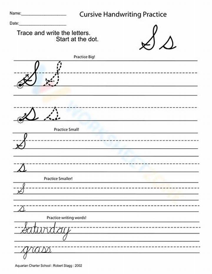
Capital S in cursive has a handful of recurring problems. The good news: each one has a straightforward fix once you know what to look for.
1) The S looks lopsided
Usually your curves don’t match in size, or the middle turn shifts left or right. Fix it by checking symmetry: compare the top curve size with the bottom curve size. If they don’t match, practice the top and bottom separately before reconnecting.
2) The middle turn looks like a bump or corner
This happens when your pen stops or changes direction too sharply. Fix it by slowing only at the middle turn. Think “smooth steering,” not “make a point.”
3) The letter is too tall or too short
If the middle of the S sits too low, everything feels heavy. If it’s too high, it looks squeezed. Use height guides and aim for the midpoint of the S to land on your midline (or at least stay consistent across repetitions).
4) The exit stroke doesn’t help the next letter
When the exit is weak, cursive connections fail and the whole word looks disconnected. Fix it by practicing the capital S followed by one specific connector letter repeatedly until it feels automatic.
5) Pen pressure makes thick lines
Many learners press harder as they reach the middle or finish. Cursive should feel controlled, not forced. If you see dark, thick segments, lighten your grip and slow down slightly—pressure drops when you trust the motion.
If you want a simple rule: write one capital S, look for the one biggest flaw, adjust, then repeat—don’t rewrite everything at random.

